vow venue
Vow Venue transforms wedding chaos into calm with streamlined planning and beautifully personalized details.
-
![]()
Role: UX Researcher & Designer
Project Type: End-to-End UX Case Study
Duration: 6 Weeks
Tools: Figma · FigJam · Google Forms
Team Collaboration: DesignLab Mentor · Peer Feedback Sessions
Deliverables: Personas · Research Plan · Wireframes · Prototype · Usability Report -
![]()
Uncover what makes wedding planning stressful and transform fragmented experiences into a personalized, intuitive platform that guides users from inspiration to "I do" without the chaos.
-
![]()
Reduced user overwhelm by 50% during testing through smart content curation, guided flows, and vendor coordination tools, making planning feel doable and even fun.
-
![]()
User Interviews (5 total)
Usability Testing
Competitive Analysis
Journey Mapping
Card Sorting
Affinity Mapping
Information Architecture
Wireframing & Prototyping
-
![]()
Wedding planning is overwhelming. Couples struggle with scattered tools and decisions.
The goal: simplify the chaos into one intuitive platform.
-
![]()
Led UX research and design from discovery to testing, turning real user stress into a streamlined, personalized experience.
-
![]()
Weddings & Events
Lifestyle Tech
Consumer Services


Key Features
Personalized Inspiration Feeds
A quiz-driven experience that curates wedding ideas based on user preferences, helping couples visualize and refine their unique wedding style.

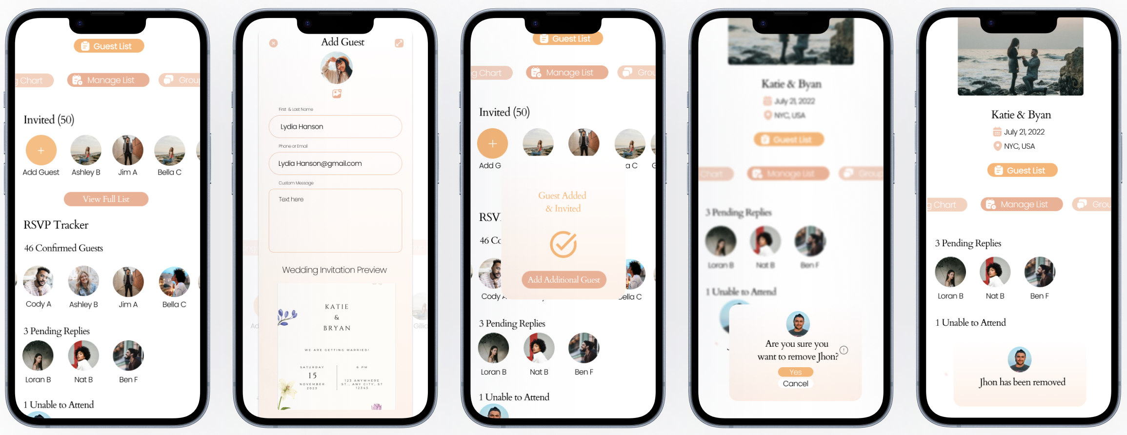
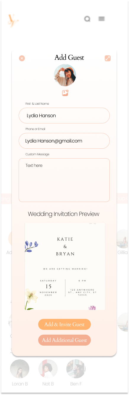
Streamlined Guest Management
Track RSVPs and guest communication in one intuitive, centralized interface.
Streamlined Vendor Communication
Message vendors directly within the platform for seamless coordination and real-time updates—all in one user-friendly hub.

Approach
User Interviews Summuary
Objective
Understand how couples plan weddings, uncover key pain points, and validate demand for an all-in-one platform like Vow Venue.
Method
Conducted five 1:1 remote interviews (30–45 min) with individuals actively planning or recently married. Focus areas included vendor workflows, guest management, and communication gaps.

Key Insights

Planning Is Scattered
Couples used 4–6 tools, causing stress, confusion, and missed details.
Vendor Communication Gets Lost
Couples struggled to track responses and manage conversations across multiple platforms.
Affinity Map
Guest List Management Is Clunky
Couples found it hard to collaborate on a shared, real-time list with partners or family.
Opportunity for a Unified Platform
Users want one system to manage vendors, inspiration, and guest lists—all in one place.

Synthesized interview insights into actionable design strategies using an affinity map.
Card Sorting
I aimed to understand how engaged users naturally group wedding tasks to inform a clear, intuitive navigation structure.

Conducted a competitive audit to uncover experience gaps and guide strategic innovation.
Click the title to dive deeper.
Using insights from interviews and card sorting, I created a site map and task flows to reflect how users naturally organize and move through the wedding planning journey.
Site Map

User Flow


Personas
Task Flow

Design Takeaways
Consolidate tools into one hub: vendors, communication, inspiration, and guest list
Design a vendor inbox with message history and status tracking
Create an inspiration feed that adapts to couple preferences (budget, style, location)
Enable real-time guest list collaboration with permissions and smart syncing

I Created 2 user personas to represent distinct planning styles and needs.

-
Janice Hudson
Age: 28
Location: Atlanta, GA
Role: Marketing Coordinator
Status: Engaged (10 months to go)
Goals
Find vendors that fit style + budget
Stay organized without stress
Get inspired without decision fatigue
Pain Points
Lost in platform-hopping and Pinterest overload
Struggles with pricing comparisons and unclear next steps
Gets overwhelmed by too many choices
Behaviors
Browses inspo late at night
Leans on friend recs
Wants tech that simplifies, not adds stress
"I want to enjoy the process, but right now it just feels chaotic."

-
David Ramos
Age: 32
Location: Austin, TX
Role: Data Analyst
Status: Engaged (6 months to go)
Goals
Stay on track + within budget
Manage RSVPs and guest logistics
Be involved in vendor decisions + communication
Pain Points
Frustrated by switching between tools
Struggles to see the big picture
Wants transparent pricing + vendor reviews
Behaviors
Uses Trello and Notion
Prefers clean, data-driven interfaces
Makes practical, informed choices
"I want a single platform that lets us plan everything without second-guessing ourselves."

Design
Mid-Fidelity Wire Frames


Testing & Iteration
Conducted usability testing with 5 participants to assess clarity and ease of use. Iterated on key features to streamline navigation and improve content personalization.
Before

Users found the original questions too vague, making personalized results feel off-target.
After

Introduced refined, targeted questions to better capture each couple’s style, resulting in a more relevant, personalized feed aligned with their vision.
Before

Users couldn’t easily tell which messages were opened, causing confusion and hurting navigation clarity.
After

Added bold indicators for unopened messages, boosting readability and enhancing the overall user experience.
Before

Users were restricted to a single Inbox view, making it hard to find drafts or deleted messages, causing workflow friction.
After

Introduced categorized tabs: All, Archive, Drafts, and Trash to improve message management, streamline workflows, and boost usability.
Design System
To ensure a consistent and engaging user experience, I created:
A cohesive design system
Featuring accessible typography, a refined color palette, intuitive iconography, and responsive layouts for all devices.A modern logo
Blending tradition and elegance to reflect the romantic essence of weddings and establish a memorable brand identity.
Primary

Typography

Top Navigation Bar
Neutral


Bottom Navigation Bar

Icons

Footer

Buttons
Secondary


Card

High Fidelity Wireframes
Sign In/Sign Up


Feed & Home Page

Guest List Management


Vendor Profile & Communication


Final Outcome
The final responsive platform empowers couples to plan with ease, offering intuitive tools for every stage.
Vow Venue bridges logistics and inspiration by addressing user needs holistically.
It also reduced user overwhelm by 50% during testing through smart content curation, guided flows, and vendor coordination tools, making planning feel doable and even fun.
Reflection
This project underscored the power of empathy and iteration in great design:
Empathy in Design
User behavior and emotional needs guided every decision for a truly human-centered experience.Mobile-First Thinking
Starting with smaller screens honed clarity, prioritization, and simplicity.Iterative Problem-Solving
Ongoing feedback loops led to meaningful improvements in both functionality and usability.
Case Studies

Aura Voice


Youtube Music Circle
Cake Palette

Jet Set Airways